For a real estate company, the identity had to communicate stability and ambition at the same time.
The idea
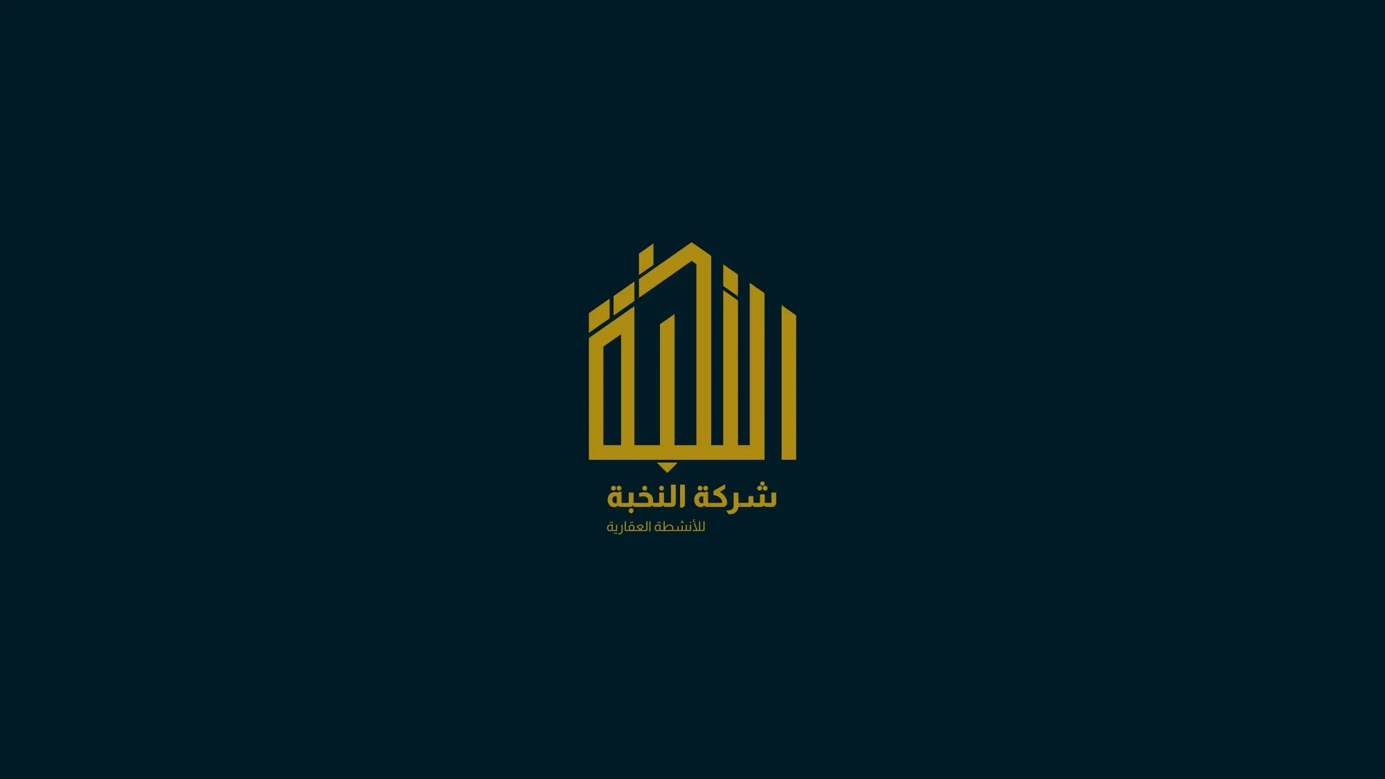
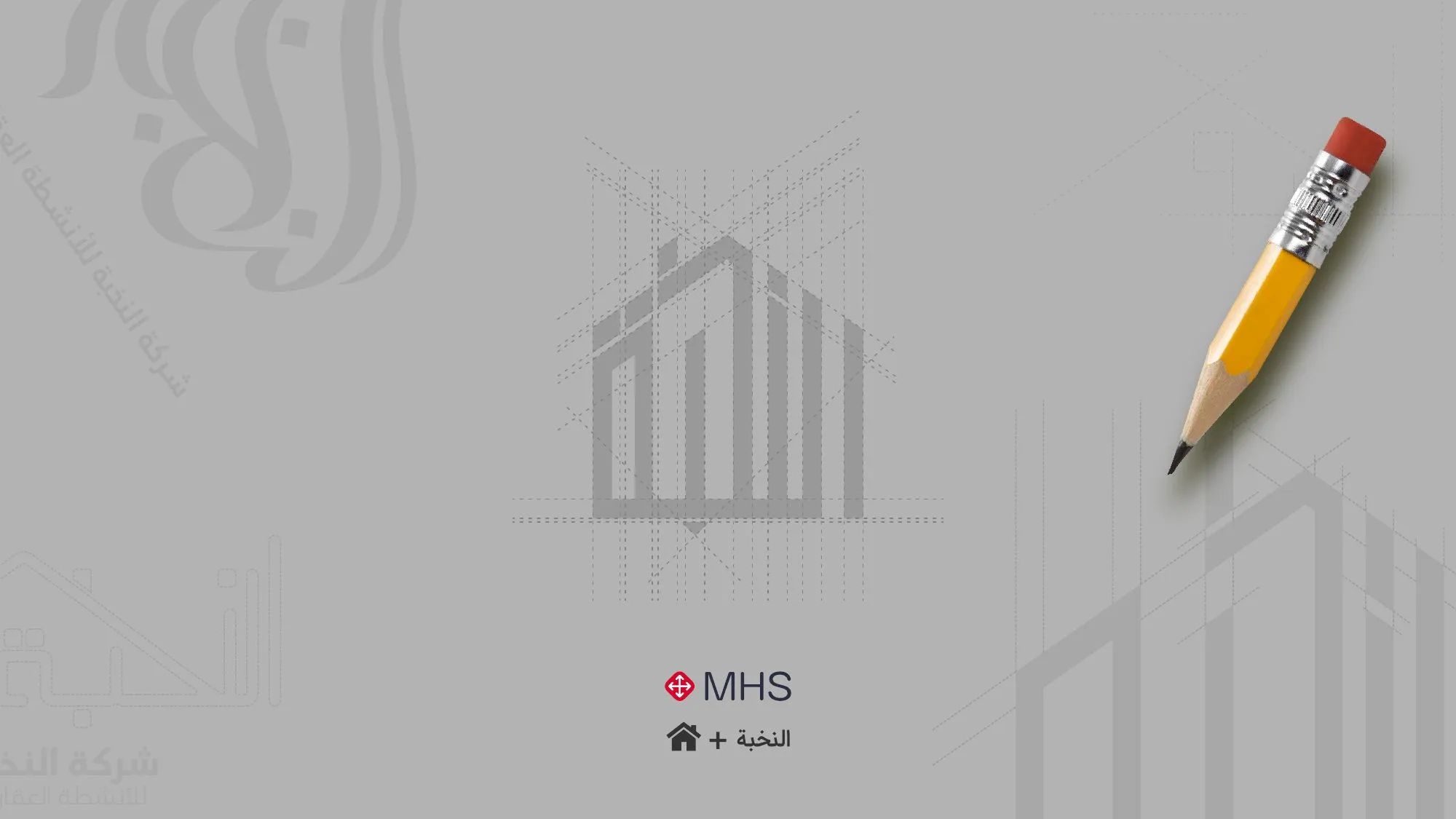
The symbol combines building silhouettes rising in sequence — a skyline that also reads as growth. Gold on deep black gives the brand weight and a sense of value, and the Arabic logotype sits with the symbol as one balanced lockup.
Scope
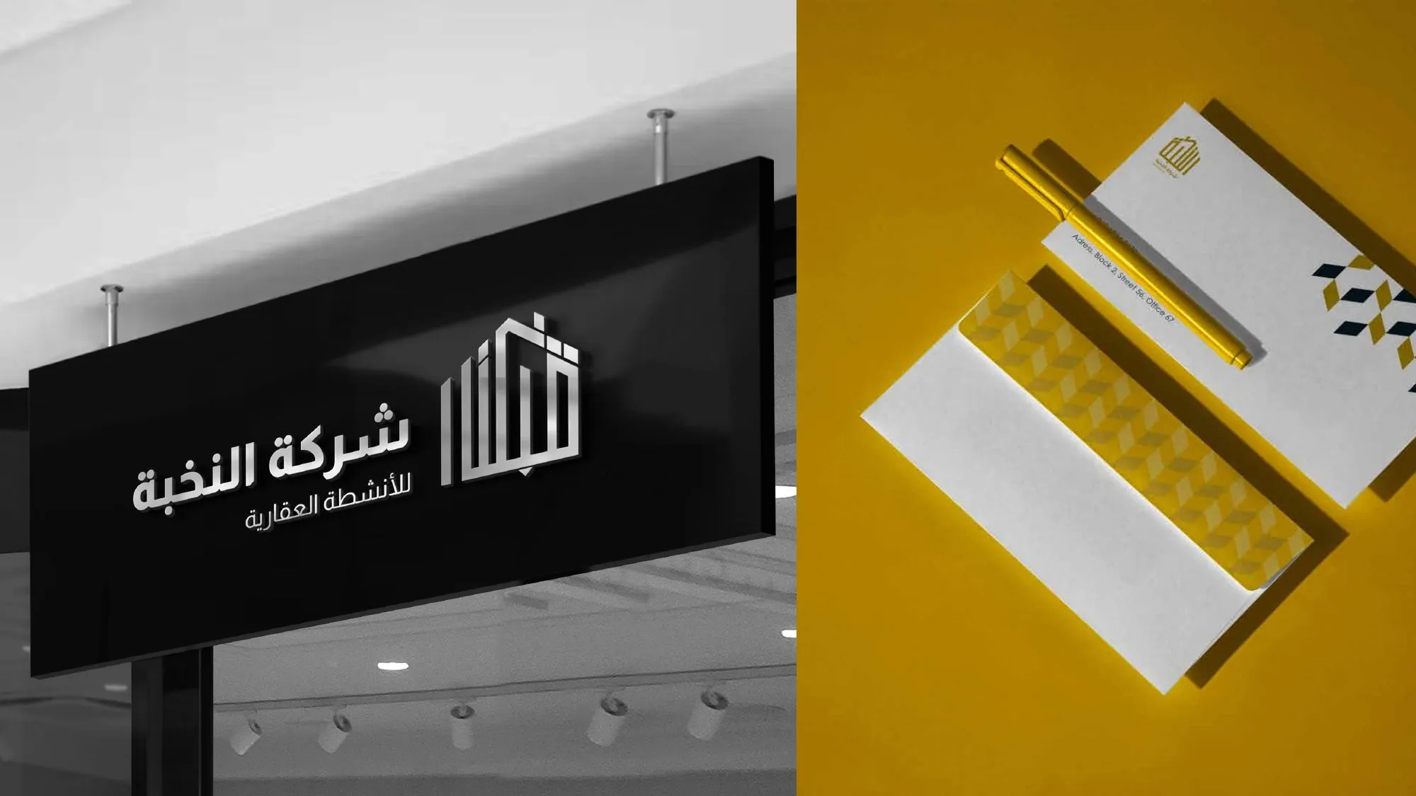
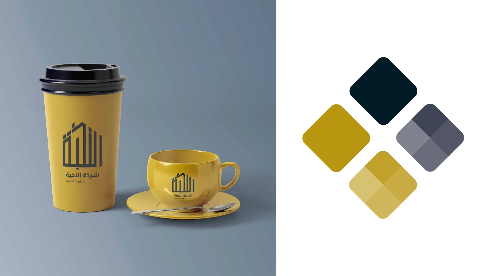
Logo, bilingual lockups, colour system, stationery, signage and branded applications.