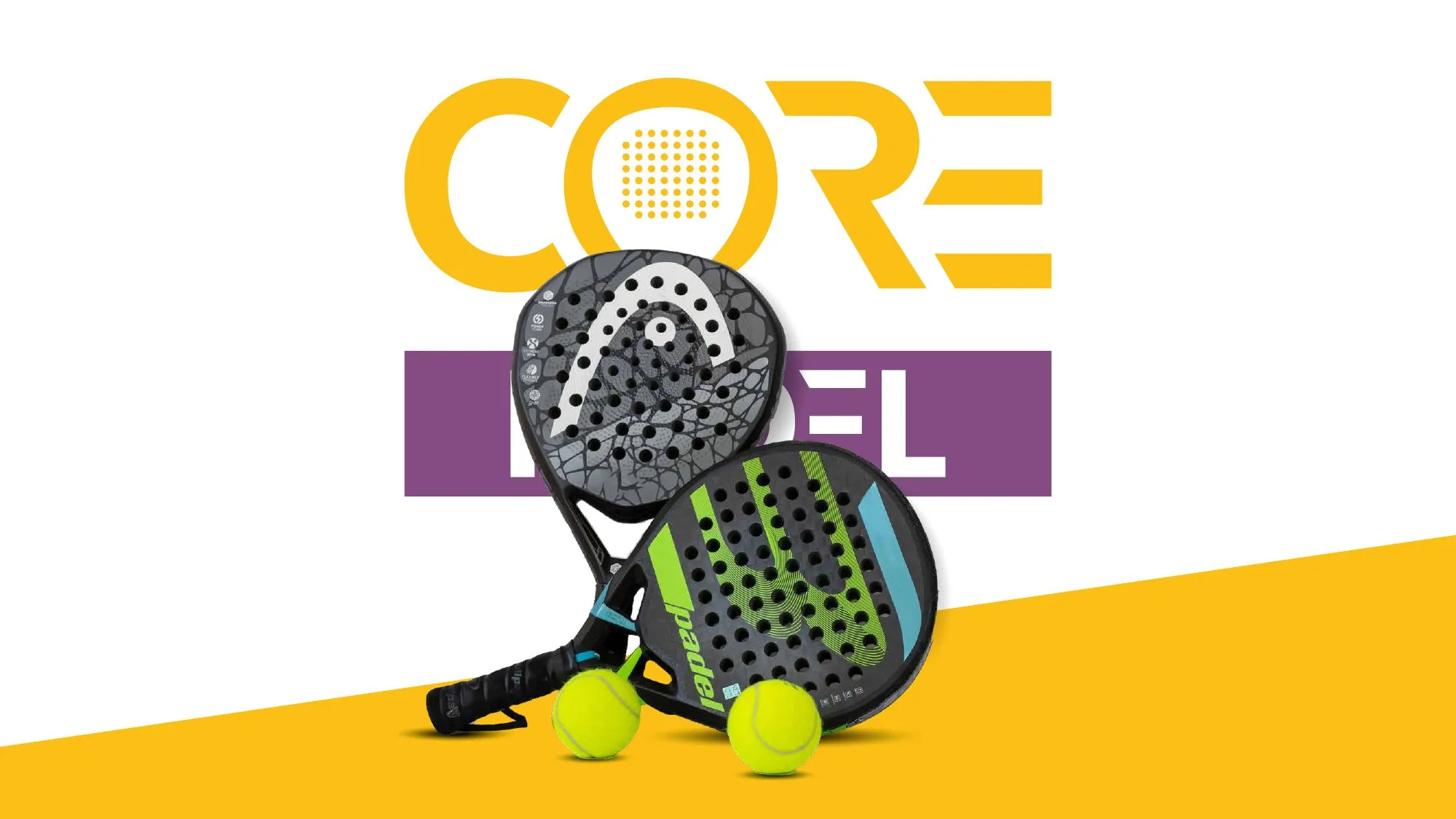
Core Padel needed an identity with energy, but one that would still feel like a club people belong to — not just another sports logo.
The idea
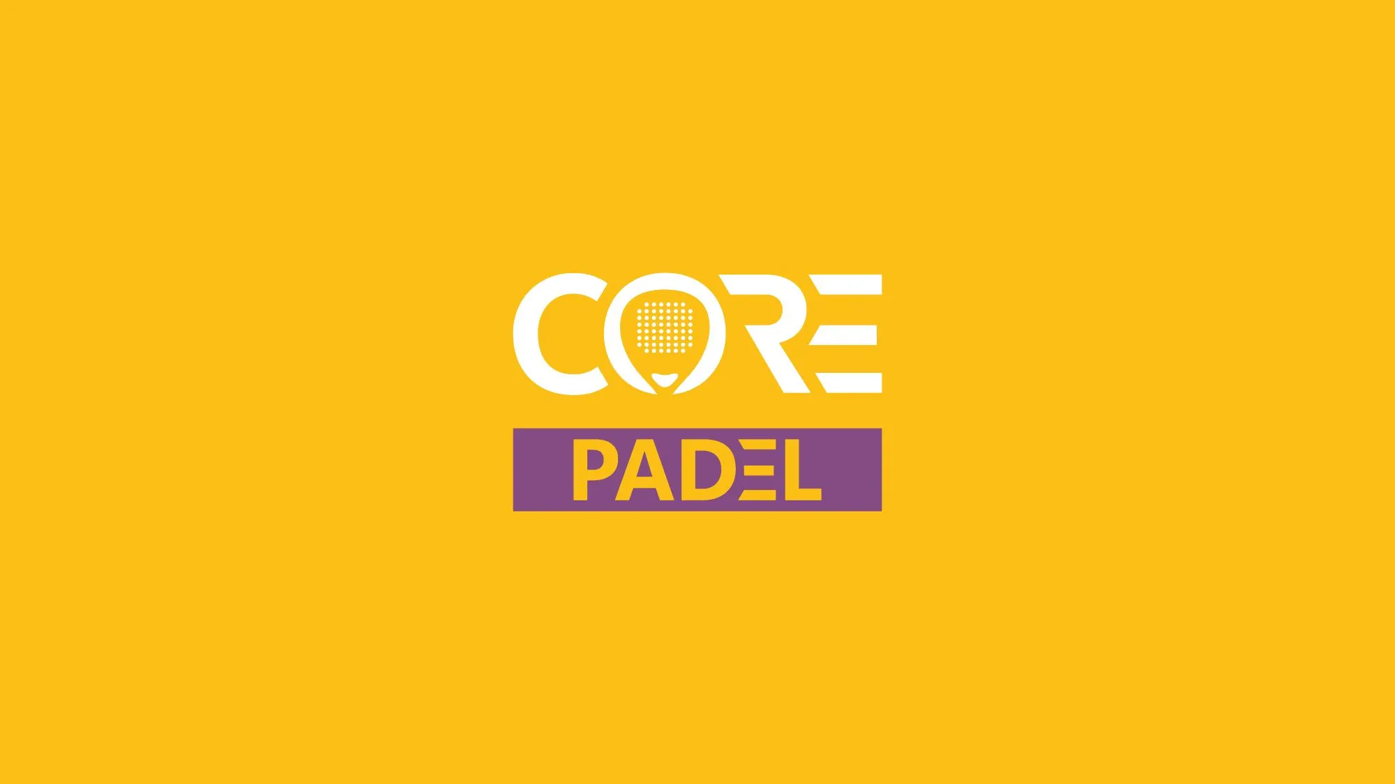
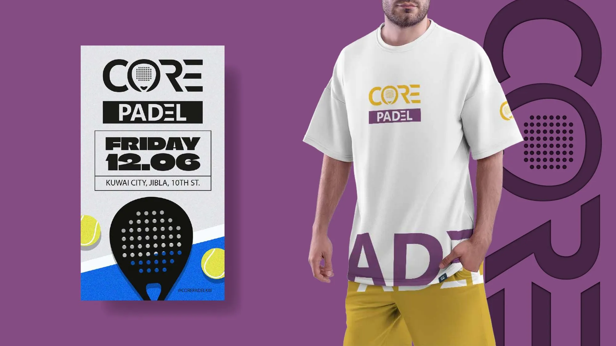
The wordmark is built from the geometry of the game itself: the O becomes a padel racket, and the cut letters echo court lines. Yellow and purple give the brand a confident, high-contrast presence on apparel, signage and social media.
Scope
Logo and wordmark, colour and typography, merchandise, and event communication.
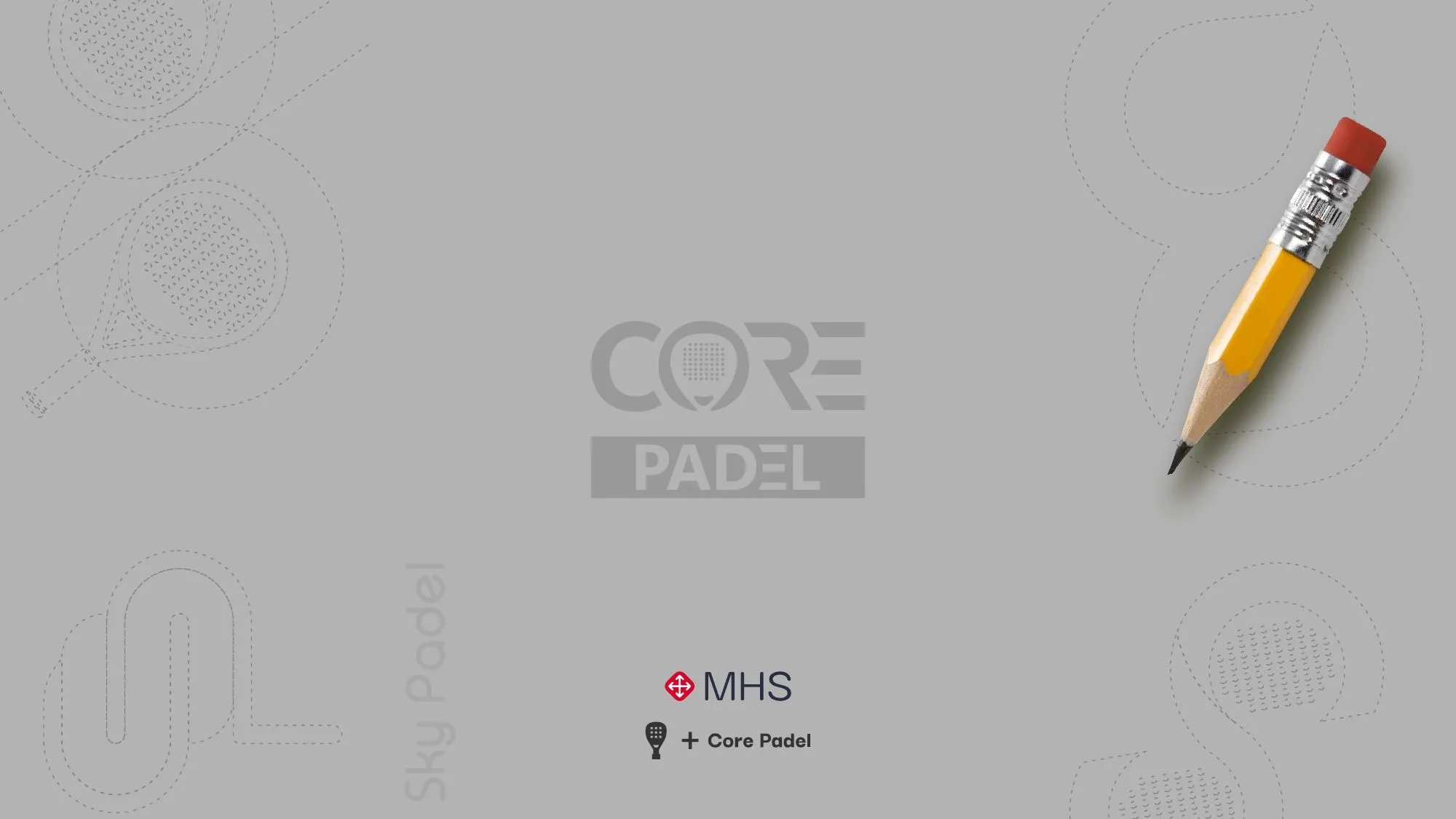
Primary logoApplications: apparel and event posterFrom sketch to construction